When many small business owners hear the word “content”, they picture blog posts. They envision costly video production. They see memes.
But what if I told you that FAQ pages have the ability to not only attract but win customers over?
Think about it: the last time you voiced or typed searched in Google, was it a question or a statement?
I’ll go out on a limb here and assume that it was a question.
It’s why most of us search online; we have questions we want to be answered before we investigate further, click on another link, and make a purchase. We all want the best product or service, and value for our dollar and the best way to get both is to ask questions.
For this reason, FAQ pages have become a the leading ways to win over customers. For a few years, it was almost taboo to have a FAQ page on a website, which is why many of your competitors won’t have this valuable conversion-rich page available to their users.
As it turns out, FAQ pages are more valuable than ever and are a necessary add-on (especially with the rise of voice search!). Here’s how you can maximise their potential:
Don’t Assume the Questions-Answers You Come Up With Are The Right Ones
Business owners tend to project their own questions and concerns when writing out their FAQs. Sometimes you may be on point.
In many cases, you’re probably way off the mark.
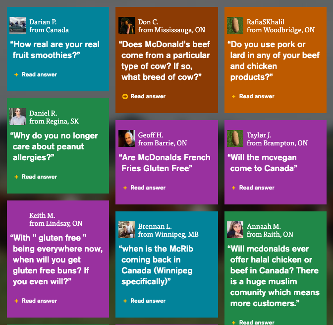
Remember that you’re communicating with audiences who may have no idea who you and your product or services are about. Talk with visitors and customers about their concerns or confusions (hint: consult your help desk people if you have them) and then make sure that these are included on your FAQ page. McDonald’s Canada has made a feature of their FAQs, even breaking them down over several categories, one per page, and added the names and location of those who asked the question – powerful!) and is a prime example of hitting this nail on the head. The goal is to educate through proper content rather than bore audiences with redundant or unwanted knowledge.

Don’t Use Your FAQs To Pitch
The second you turn a question into an opportunity for pushing a sale, readers will tune out.
Those who take the time to visit your FAQ page – which is usually a whole new click or two, indicating extra effort and interest on their part – want to learn more about you, your product or service, and what they can expect.
What they don’t want is a pitch.
As we touched upon before, your FAQs should be purely educational. If a question can be better answered in a longer form, create a white paper, blog post, or sub-page and link to it rather than choking up your FAQ page.
Don’t Mindlessly Scatter your FAQs
Your FAQ page should ideally create a brand and product journey where an audience’s understanding of your company and what you have to offer unfolds along the way. Though FAQs may seem fairly straightforward – which of course, they can be – they can also give audiences a nice snapshot of your company’s history, purpose, and goals by compiling questions in an orderly way.
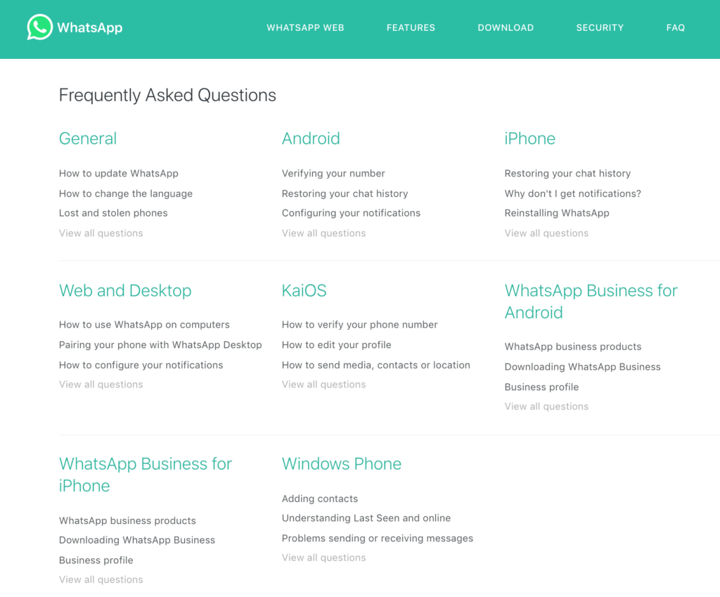
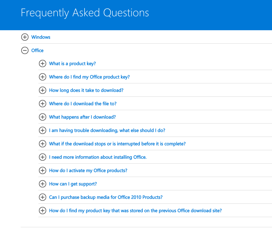
This not only means placing certain questions within certain categories (check out WhatsApp’s or Microsoft’s FAQs and you’ll see what we mean). Insert noticeable headlines, so the navigation process is as seamless as possible for your audience. The sooner someone can find an answer to their question, the more likely they are to remain engaged.


At the end of the day, the goal of any FAQ page is to keep your audience focused and engaged. As long as your FAQ page is built around the problems your audience needs solving, you’ll be a long way ahead of the curve.

FAQ pages are one of the favorite types of content I like to create for my clients. If you need help with yours, I welcome your call on +61 412656208, or email [email protected].

Excellent tips and excellent idea about making the blog post instead of a super long FAQ answer, would have never though of this.
Abigail, since writing your comment I’ve added my own FAQ page to this site too: https://kerryfinchwriting.com/faqs/
Great examples of FAQ pages. I am currently writing mine right now.
I’ve recently added one to my own site Paul, and after sharing it on my FB page and LinkedIn, it has generated a lot of enquiries. Good luck with yours.
I like the block style layout in the McDonald’s example for the FAQ page. I think it draws more attention to the questions, and makes it fun at the same time. Def. gonna draw some inspiration from this!
I went to a site the other day that had “product pitching” type sounding questions on their FAQ page, was a big turn off for me on their products.
I know! FAQs are ideal for giving more in-depth information about a product or service, and when written with this in mind, they should instil more of the confidence a reader will need to make a purchase/contact decision.
I love good, detailed FAQ pages purely because of the transparency it gives a website.
I agree. A solid FAQ page can really cut down on a lot of hassle for a curious customer, answering often previously unthought of questions and giving you the opportunity to write in more detail on aspects that might not warrant so much within your site’s other pages.